// Hero + Estrutura + Para quem é o espaço

// Stock images / local assets (nature/retreat/Gramado-like atmospheres)
const STOCK = {
  heroSerra: 'gallery/hero-new.jpg',
  heroMoon: 'gallery/hero-new.jpg',
  hero: 'gallery/hero-new.jpg',
  estrutura1: 'gallery/estrutura.webp',
  estrutura2: 'gallery/estrutura.webp',
  paraQuem1: 'gallery/para-quem-conduz.webp',
  paraQuem2: 'gallery/para-quem-pausar.webp'
};

// ─── Hero ─────────────────────────────────────────────────────────────────
function Hero({ headline, layout = 'full' }) {
  const isFull = layout === 'full';
  return (
    <section id="hero" style={{
      position: 'relative',
      minHeight: '100vh',
      paddingTop: 120,
      paddingBottom: 80,
      overflow: 'hidden',
      display: 'flex',
      alignItems: 'center'
    }}>
      {/* Background image */}
      {isFull &&
      <div style={{ position: 'absolute', inset: 0, zIndex: 0 }}>
          <image-slot
          id="hero-bg-v2"
          src={STOCK.heroSerra}
          shape="rect"
          fit="cover"
          placeholder="Foto de fundo da serra / Espaço Luna"
          style={{ width: '100%', height: '100%', display: 'block' }}>
        </image-slot>
          {/* Dark overlay */}
          <div style={{
          position: 'absolute', inset: 0,
          background: 'linear-gradient(180deg, rgba(14,19,34,.5) 0%, rgba(14,19,34,.65) 50%, rgba(14,19,34,.95) 100%)'
        }} />
          {/* Subtle gold radial accent — moon-like */}
          <div style={{
          position: 'absolute',
          top: '8%', right: '8%',
          width: 320, height: 320,
          borderRadius: '50%',
          background: 'radial-gradient(circle, rgba(212,184,150,.18) 0%, transparent 65%)',
          filter: 'blur(10px)',
          pointerEvents: 'none'
        }} />
        </div>
      }

      <div className="container" style={{
        position: 'relative',
        zIndex: 1,
        display: 'grid',
        gridTemplateColumns: isFull ? '1fr' : 'minmax(0,1.05fr) minmax(0,1fr)',
        gap: isFull ? 0 : 64,
        alignItems: 'center'
      }}>
        <div style={{
          maxWidth: isFull ? 920 : 'none',
          margin: isFull ? '0 auto' : 0,
          textAlign: isFull ? 'center' : 'left'
        }}>
          <div className={isFull ? 'ornament' : 'ornament left'} style={{
            justifyContent: isFull ? 'center' : 'flex-start',
            marginBottom: 28,
            maxWidth: isFull ? 320 : 240,
            marginInline: isFull ? 'auto' : 0
          }}>
            <span>Gramado · RS</span>
          </div>

          <h1 className="h1 serif" style={{ marginBottom: 28 }}>
            <span className="italic">{headline.lead}</span>
            <br />
            <span style={{ color: 'var(--gold)' }}>{headline.tail}</span>
          </h1>

          <p className="lede" style={{
            marginInline: isFull ? 'auto' : 0,
            marginBottom: 40,
            fontSize: 'clamp(16px, 1.6vw, 20px)'
          }}>
            Na serra de Gramado/RS, o Espaço Luna une natureza, hospedagem e presença para retiros, formações e experiências que pedem profundidade.
          </p>

          <div style={{
            display: 'flex',
            gap: 16,
            flexWrap: 'wrap',
            justifyContent: isFull ? 'center' : 'flex-start'
          }}>
            <a href="#contato" className="btn btn-primary">
              Solicitar proposta <span className="btn-arrow"></span>
            </a>
            <a href="#estrutura" className="btn btn-ghost">
              Conhecer estrutura
            </a>
          </div>
        </div>

        {!isFull &&
        <div style={{ position: 'relative' }}>
            <image-slot
            id="hero-split-v2"
            src={STOCK.heroMoon}
            shape="rounded"
            radius="8"
            fit="cover"
            placeholder="Foto principal do Espaço Luna"
            style={{ width: '100%', aspectRatio: '3/4', display: 'block', borderRadius: 8 }}>
          </image-slot>
            <div style={{
            position: 'absolute',
            bottom: -40, left: -40,
            width: 200, height: 200,
            borderRadius: '50%',
            background: 'radial-gradient(circle, rgba(212,184,150,.3) 0%, transparent 65%)',
            filter: 'blur(20px)',
            pointerEvents: 'none'
          }} />
          </div>
        }
      </div>

      {/* Scroll cue removed — was overlapping the CTAs at certain viewport heights */}

      <style>{`
        @keyframes fade-pulse { 0%, 100% { opacity: 0.45; } 50% { opacity: 0.9; } }
      `}</style>
    </section>);

}

// ─── Estrutura física ─────────────────────────────────────────────────────
function Estrutura() {
  const specs = [
  { label: 'Salão principal', value: '180', unit: 'm²' },
  { label: 'Capacidade formato U', value: '40', unit: 'pessoas' },
  { label: 'Hospedagem', value: '21', unit: 'leitos' },
  { label: 'Refeitório', value: '60', unit: 'lugares' },
  { label: 'Ar-condicionado', value: 'sim', unit: '· salão e quartos' },
  { label: 'Área de coffee', value: 'sim', unit: '· servida' },
  { label: 'Área para dinâmicas', value: '∞', unit: '· em meio à mata nativa' }];


  const amenities = [
  'Banheiros amplos e adaptados',
  'Cozinha equipada para refeições',
  'Wi-Fi em toda a estrutura',
  'Estacionamento privativo',
  'Roupa de cama e banho fornecidas',
  'Espaços externos para vivências',
  'Templo Lunar para rituais',
  'Lofts nomeados em homenagem às deusas'];


  return (
    <section id="estrutura" style={{
      padding: 'var(--section-y) 0',
      background: 'var(--bg)'
    }}>
      <div className="container">
        <div style={{
          display: 'grid',
          gridTemplateColumns: 'minmax(0,1.1fr) minmax(0,1fr)',
          gap: 64,
          marginBottom: 80,
          alignItems: 'end'
        }} className="estrutura-head">
          <div>
            <div className="eyebrow" style={{ marginBottom: 20 }}>02 · Estrutura</div>
            <h2 className="h2 serif">
              <span className="italic">Tudo o que você precisa</span>{' '}
              <span style={{ color: 'var(--gold)' }}>para conduzir bem.</span>
            </h2>
          </div>
          <p className="lede">
            Cada detalhe do Espaço Luna foi pensado para sustentar experiências profundas sem abrir mão do conforto. Enquanto você conduz o encontro, o ambiente cuida do restante.
          </p>
        </div>

        {/* Numbers grid */}
        <div style={{
          display: 'grid',
          gridTemplateColumns: 'repeat(auto-fit, minmax(220px, 1fr))',
          gap: 1,
          background: 'var(--line)',
          border: '1px solid var(--line)',
          marginBottom: 80
        }}>
          {specs.map((s, i) =>
          <div key={i} style={{
            background: 'var(--bg)',
            padding: '36px 28px',
            display: 'flex',
            flexDirection: 'column',
            gap: 10,
            minHeight: 160,
            justifyContent: 'space-between'
          }}>
              <div style={{
              fontSize: 11,
              letterSpacing: '0.18em',
              textTransform: 'uppercase',
              color: 'var(--muted)'
            }}>{s.label}</div>
              <div style={{ display: 'flex', alignItems: 'baseline', gap: 8, flexWrap: 'wrap' }}>
                <span className="serif" style={{
                fontSize: 'clamp(40px, 4.5vw, 60px)',
                lineHeight: 1,
                color: 'var(--gold)',
                fontWeight: 400
              }}>{s.value}</span>
                <span style={{ fontSize: 13, color: 'var(--muted)' }}>{s.unit}</span>
              </div>
            </div>
          )}
        </div>

        {/* Image + amenities split — heights matched, amenities in 2 cols */}
        <div style={{
          display: 'grid',
          gridTemplateColumns: 'minmax(0,1fr) minmax(0,1.05fr)',
          gap: 48,
          alignItems: 'stretch'
        }} className="estrutura-split">
          {/* Image fills full column height */}
          <div style={{ position: 'relative', minHeight: 480 }} className="estrutura-img-wrap">
            <image-slot
              id="estrutura-img-v3"
              src={STOCK.estrutura1}
              shape="rounded"
              radius="6"
              fit="cover"
              placeholder="Foto do salão montado"
              style={{ width: '100%', height: '100%', display: 'block', borderRadius: 6, position: 'absolute', inset: 0 }}>
            </image-slot>
          </div>

          <div style={{ display: 'flex', flexDirection: 'column', justifyContent: 'space-between', gap: 24 }}>
            <div>
              <h3 className="h3 serif italic" style={{ marginBottom: 24, color: 'var(--ink)' }}>
                E mais o que está em todo lugar.
              </h3>
              <ul style={{
                listStyle: 'none', padding: 0, margin: 0,
                display: 'grid',
                gridTemplateColumns: 'repeat(2, 1fr)',
                columnGap: 24,
                rowGap: 0
              }} className="amenities-grid">
                {amenities.map((a, i) =>
                <li key={i} style={{
                  display: 'flex',
                  alignItems: 'flex-start',
                  gap: 12,
                  padding: '12px 0',
                  borderBottom: '1px solid var(--line)',
                  color: 'var(--ink)',
                  fontSize: 14
                }}>
                    <span style={{
                    color: 'var(--gold)',
                    flexShrink: 0,
                    marginTop: 4
                  }}>
                      <svg width="12" height="12" viewBox="0 0 14 14" fill="none">
                        <circle cx="7" cy="7" r="6" stroke="currentColor" strokeWidth="0.8" opacity="0.5" />
                        <circle cx="7" cy="7" r="2.5" fill="currentColor" />
                      </svg>
                    </span>
                    <span>{a}</span>
                  </li>
                )}
              </ul>
            </div>

            <div style={{
              padding: 24,
              background: 'var(--bg-2)',
              border: '1px solid var(--line)',
              borderRadius: 6
            }}>
              <div className="eyebrow" style={{ marginBottom: 8 }}>Opções de locação</div>
              <p style={{ fontSize: 15, color: 'var(--ink)', marginBottom: 8 }}>
                <strong style={{ fontWeight: 500 }}>Apenas salão</strong> · para eventos de até 1 dia
              </p>
              <p style={{ fontSize: 15, color: 'var(--ink)' }}>
                <strong style={{ fontWeight: 500 }}>Salão + hospedagem</strong> · imersões de 2 a 7 dias
              </p>
            </div>
          </div>
        </div>
      </div>

      <style>{`
        @media (max-width: 820px) {
          .estrutura-head { grid-template-columns: 1fr !important; gap: 24px !important; }
          .estrutura-split { grid-template-columns: 1fr !important; gap: 36px !important; }
          .estrutura-img-wrap { min-height: 320px !important; }
        }
        @media (max-width: 520px) {
          .amenities-grid { grid-template-columns: 1fr !important; }
        }
      `}</style>
    </section>);

}

// ─── Galeria (carrossel de fotos) ─────────────────────────────────────────
function Galeria() {
  const photos = [
  { id: 'galv2-1', src: 'gallery/01.jpg', cap: 'Encontro · Mata nativa' },
  { id: 'galv2-2', src: 'gallery/02.png', cap: 'Lofts · Bruma da manhã' },
  { id: 'galv2-3', src: 'gallery/03.jpg', cap: 'Roda de fogo · Noite' },
  { id: 'galv2-4', src: 'gallery/04.jpg', cap: 'Meditação · Pedra' },
  { id: 'galv2-5', src: 'gallery/05.jpg', cap: 'Jardim Yin-Yang' },
  { id: 'galv2-6', src: 'gallery/06.png', cap: 'Hospedagem · Pátio' },
  { id: 'galv2-7', src: 'gallery/07.jpg', cap: 'Vivência · Grupo' },

  { id: 'galv2-12', src: 'gallery/12.png', cap: 'Lofts · Lilith · Artemis · Magdalena' },
  { id: 'galv2-13', src: 'gallery/13.jpg', cap: 'Loft · Caminho de madeira' },
  { id: 'galv2-14', src: 'gallery/14.jpg', cap: 'Silêncio · Mata' },
  { id: 'galv2-15', src: 'gallery/15.jpg', cap: 'Vista da serra' },
  { id: 'galv2-16', src: 'gallery/16.jpg', cap: 'Loft · Magdalena' },

  { id: 'galv2-18', src: 'gallery/18.jpeg', cap: 'Salão · Roda' },
  { id: 'galv2-19', src: 'gallery/19.jpeg', cap: 'Quarto · Descanso' },
  { id: 'galv2-20', src: 'gallery/20.jpeg', cap: 'Salão · Vivência' },
  { id: 'galv2-21', src: 'gallery/21.jpeg', cap: 'Boas-vindas' },
  { id: 'galv2-22', src: 'gallery/22.jpeg', cap: 'Espaço Luna · Entrada' },
  { id: 'galv2-23', src: 'gallery/23.jpeg', cap: 'Encontro · Salão' },
  { id: 'galv2-24', src: 'gallery/24.jpeg', cap: 'Lofts · Mata' },
  { id: 'galv2-25', src: 'gallery/25.jpeg', cap: 'Vivência · Cores' }];


  const trackRef = React.useRef(null);
  const [canPrev, setCanPrev] = React.useState(false);
  const [canNext, setCanNext] = React.useState(true);
  const [paused, setPaused] = React.useState(false);
  const [lightboxIdx, setLightboxIdx] = React.useState(null);
  const [lightboxSrc, setLightboxSrc] = React.useState(null);

  // Resolve the *actually displayed* src for a photo (user-dropped image
  // inside <image-slot> wins over the default URL). Reaches into the slot's
  // shadow DOM <img>; falls back to the photo's default src.
  const resolveSrc = React.useCallback((idx) => {
    const photo = photos[idx];
    if (!photo) return null;
    const slot = document.getElementById(photo.id);
    if (slot && slot.shadowRoot) {
      const img = slot.shadowRoot.querySelector('img[part="image"]');
      if (img && img.src) return img.src;
    }
    return photo.src;
  }, []);

  const openLightbox = React.useCallback((idx) => {
    setLightboxIdx(idx);
    setLightboxSrc(resolveSrc(idx));
  }, [resolveSrc]);

  // Whenever the lightbox index changes, re-resolve the current src so
  // arrow-nav also pulls the latest dropped image.
  React.useEffect(() => {
    if (lightboxIdx === null) return;
    setLightboxSrc(resolveSrc(lightboxIdx));
  }, [lightboxIdx, resolveSrc]);

  const checkBounds = React.useCallback(() => {
    const el = trackRef.current;
    if (!el) return;
    setCanPrev(el.scrollLeft > 8);
    setCanNext(el.scrollLeft < el.scrollWidth - el.clientWidth - 8);
  }, []);

  React.useEffect(() => {
    const el = trackRef.current;
    if (!el) return;
    checkBounds();
    el.addEventListener('scroll', checkBounds, { passive: true });
    window.addEventListener('resize', checkBounds);
    return () => {
      el.removeEventListener('scroll', checkBounds);
      window.removeEventListener('resize', checkBounds);
    };
  }, [checkBounds]);

  // Auto-scroll: continuous gentle drift, pauses on hover or when lightbox is open
  React.useEffect(() => {
    const el = trackRef.current;
    if (!el) return;
    if (paused || lightboxIdx !== null) return;

    let rafId;
    let last = performance.now();
    const speed = 40; // px per second

    const tick = (now) => {
      const dt = (now - last) / 1000;
      last = now;
      const maxScroll = el.scrollWidth - el.clientWidth;
      if (maxScroll <= 0) {
        rafId = requestAnimationFrame(tick);
        return;
      }
      let next = el.scrollLeft + speed * dt;
      if (next >= maxScroll - 1) {
        // Loop back to start smoothly
        next = 0;
      }
      el.scrollLeft = next;
      rafId = requestAnimationFrame(tick);
    };
    rafId = requestAnimationFrame(tick);
    return () => cancelAnimationFrame(rafId);
  }, [paused, lightboxIdx]);

  const scroll = (dir) => {
    const el = trackRef.current;
    if (!el) return;
    const card = el.querySelector('[data-gal-card]');
    const step = card ? card.offsetWidth + 16 : 360;
    const maxScroll = el.scrollWidth - el.clientWidth;
    let target = el.scrollLeft + dir * step;
    // Loop at the ends
    if (target > maxScroll - 4) target = 0;else
    if (target < 4 && dir < 0) target = maxScroll;
    // Pause auto-scroll while the smooth scroll plays out so they don't fight
    setPaused(true);
    el.scrollTo({ left: target, behavior: 'smooth' });
    clearTimeout(scroll._t);
    scroll._t = setTimeout(() => setPaused(false), 900);
  };

  // Lightbox keyboard navigation
  React.useEffect(() => {
    if (lightboxIdx === null) return;
    const onKey = (e) => {
      if (e.key === 'Escape') setLightboxIdx(null);else
      if (e.key === 'ArrowRight') setLightboxIdx((i) => (i + 1) % photos.length);else
      if (e.key === 'ArrowLeft') setLightboxIdx((i) => (i - 1 + photos.length) % photos.length);
    };
    window.addEventListener('keydown', onKey);
    const prevOverflow = document.body.style.overflow;
    document.body.style.overflow = 'hidden';
    return () => {
      window.removeEventListener('keydown', onKey);
      document.body.style.overflow = prevOverflow;
    };
  }, [lightboxIdx, photos.length]);

  return (
    <section id="galeria" style={{
      padding: 'var(--section-y) 0',
      background: 'var(--bg-2)',
      borderTop: '1px solid var(--line)',
      borderBottom: '1px solid var(--line)',
      overflow: 'hidden'
    }}>
      <div className="container" style={{ marginBottom: 56 }}>
        <div style={{
          display: 'flex',
          justifyContent: 'space-between',
          alignItems: 'flex-end',
          gap: 32,
          flexWrap: 'wrap'
        }}>
          <div style={{ maxWidth: 640 }}>
            <div className="eyebrow" style={{ marginBottom: 20 }}>Galeria · O espaço</div>
            <h2 className="h2 serif">
              <span className="italic">Mais do que estrutura,</span>{' '}
              <span style={{ color: 'var(--gold)' }}>presença em cada detalhe.</span>
            </h2>
            <p className="lede" style={{ marginTop: 16 }}>
              Um primeiro olhar para os ambientes que sustentam cada encontro.
            </p>
          </div>
          <div style={{ display: 'flex', gap: 12 }}>
            <button onClick={() => scroll(-1)} aria-label="Anterior" className="gal-nav-btn" style={{
              width: 52, height: 52, borderRadius: '50%',
              background: 'transparent',
              border: '1px solid var(--gold)',
              color: 'var(--gold)',
              cursor: 'pointer',
              transition: 'all .3s',
              display: 'flex', alignItems: 'center', justifyContent: 'center'
            }}>
              <svg width="18" height="18" viewBox="0 0 24 24" fill="none" stroke="currentColor" strokeWidth="1.4">
                <line x1="20" y1="12" x2="4" y2="12" />
                <polyline points="10 18 4 12 10 6" />
              </svg>
            </button>
            <button onClick={() => scroll(1)} aria-label="Próximo" className="gal-nav-btn" style={{
              width: 52, height: 52, borderRadius: '50%',
              background: 'var(--gold)',
              border: '1px solid var(--gold)',
              color: 'var(--bg)',
              cursor: 'pointer',
              transition: 'all .3s',
              display: 'flex', alignItems: 'center', justifyContent: 'center'
            }}>
              <svg width="18" height="18" viewBox="0 0 24 24" fill="none" stroke="currentColor" strokeWidth="1.4">
                <line x1="4" y1="12" x2="20" y2="12" />
                <polyline points="14 6 20 12 14 18" />
              </svg>
            </button>
          </div>
        </div>
      </div>

      {/* Full-bleed scrollable track */}
      <div
        ref={trackRef}
        className="gal-track"
        onMouseEnter={() => setPaused(true)}
        onMouseLeave={() => setPaused(false)}
        onTouchStart={() => setPaused(true)}
        onTouchEnd={() => setPaused(false)}
        style={{
          display: 'flex',
          gap: 16,
          overflowX: 'auto',
          overflowY: 'hidden',
          scrollSnapType: paused ? 'x mandatory' : 'none',
          paddingInline: 'var(--pad-x)',
          scrollPaddingInline: 'var(--pad-x)',
          scrollbarWidth: 'none',
          WebkitOverflowScrolling: 'touch'
        }}>
        
        {photos.map((p, i) =>
        <figure
          key={p.id}
          data-gal-card
          onClick={() => openLightbox(i)}
          style={{
            flex: '0 0 clamp(260px, 32vw, 440px)',
            scrollSnapAlign: 'start',
            margin: 0,
            padding: 0,
            position: 'relative',
            cursor: 'zoom-in'
          }}>
          
            <image-slot
            id={p.id}
            src={p.src}
            shape="rounded"
            radius="4"
            fit="cover"
            placeholder={`Foto ${i + 1}`}
            style={{ width: '100%', aspectRatio: '4/5', display: 'block', borderRadius: 4 }}>
          </image-slot>
          </figure>
        )}
        {/* trailing spacer so last card can snap to start with breathing room */}
        <div style={{ flex: '0 0 1px' }} />
      </div>

      <style>{`
        .gal-track::-webkit-scrollbar { display: none; }
        .gal-nav-btn:hover:not(:disabled) { transform: translateY(-1px); }
        [data-gal-card] { transition: transform .4s ease; }
        [data-gal-card]:hover { transform: translateY(-4px); }
        [data-gal-card]:hover image-slot { filter: brightness(1.05); }
        @keyframes galFade { from { opacity: 0; } to { opacity: 1; } }
        @keyframes galZoom { from { opacity: 0; transform: scale(.96); } to { opacity: 1; transform: scale(1); } }
      `}</style>

      {/* Fullscreen lightbox */}
      {lightboxIdx !== null &&
      <div
        onClick={() => setLightboxIdx(null)}
        style={{
          position: 'fixed',
          inset: 0,
          background: 'rgba(8, 6, 4, 0.94)',
          zIndex: 1000,
          display: 'flex',
          alignItems: 'center',
          justifyContent: 'center',
          padding: 'clamp(24px, 5vw, 64px)',
          animation: 'galFade .3s ease'
        }}>
        
          {/* Close */}
          <button
          onClick={(e) => {e.stopPropagation();setLightboxIdx(null);}}
          aria-label="Fechar"
          style={{
            position: 'absolute', top: 24, right: 24,
            width: 48, height: 48, borderRadius: '50%',
            background: 'transparent', border: '1px solid var(--gold)',
            color: 'var(--gold)', cursor: 'pointer',
            display: 'flex', alignItems: 'center', justifyContent: 'center'
          }}>
          
            <svg width="20" height="20" viewBox="0 0 24 24" fill="none" stroke="currentColor" strokeWidth="1.4">
              <line x1="6" y1="6" x2="18" y2="18" />
              <line x1="18" y1="6" x2="6" y2="18" />
            </svg>
          </button>

          {/* Prev */}
          <button
          onClick={(e) => {e.stopPropagation();setLightboxIdx((i) => (i - 1 + photos.length) % photos.length);}}
          aria-label="Anterior"
          style={{
            position: 'absolute', left: 24, top: '50%', transform: 'translateY(-50%)',
            width: 56, height: 56, borderRadius: '50%',
            background: 'transparent', border: '1px solid var(--gold)',
            color: 'var(--gold)', cursor: 'pointer',
            display: 'flex', alignItems: 'center', justifyContent: 'center'
          }}>
          
            <svg width="20" height="20" viewBox="0 0 24 24" fill="none" stroke="currentColor" strokeWidth="1.4">
              <line x1="20" y1="12" x2="4" y2="12" />
              <polyline points="10 18 4 12 10 6" />
            </svg>
          </button>

          {/* Next */}
          <button
          onClick={(e) => {e.stopPropagation();setLightboxIdx((i) => (i + 1) % photos.length);}}
          aria-label="Próximo"
          style={{
            position: 'absolute', right: 24, top: '50%', transform: 'translateY(-50%)',
            width: 56, height: 56, borderRadius: '50%',
            background: 'transparent', border: '1px solid var(--gold)',
            color: 'var(--gold)', cursor: 'pointer',
            display: 'flex', alignItems: 'center', justifyContent: 'center'
          }}>
          
            <svg width="20" height="20" viewBox="0 0 24 24" fill="none" stroke="currentColor" strokeWidth="1.4">
              <line x1="4" y1="12" x2="20" y2="12" />
              <polyline points="14 6 20 12 14 18" />
            </svg>
          </button>

          <figure
          onClick={(e) => e.stopPropagation()}
          style={{
            margin: 0,
            maxWidth: 'min(1400px, 92vw)',
            maxHeight: '88vh',
            display: 'flex',
            flexDirection: 'column',
            alignItems: 'center',
            gap: 20,
            animation: 'galZoom .35s ease'
          }}>
          
            <img
            src={lightboxSrc || photos[lightboxIdx].src}
            alt=""
            style={{
              maxWidth: '100%',
              maxHeight: '82vh',
              objectFit: 'contain',
              borderRadius: 4,
              boxShadow: '0 30px 80px rgba(0,0,0,.5)'
            }} />
          
          </figure>
        </div>
      }
    </section>);
}

// ─── Para quem é o espaço ─────────────────────────────────────────────────
function ParaQuem() {
  const cards = [
  {
    tag: 'Facilitadores · Treinadores',
    title: 'Para quem conduz',
    desc: 'Para facilitadores que entendem que a experiência começa no ambiente.',
    bullets: ['Retiros e imersões', 'Formações e cursos', 'Vivências e workshops', 'Reuniões estratégicas'],
    img: STOCK.paraQuem1,
    slotId: 'pq-1'
  },
  {
    tag: 'Pessoas · Buscadores',
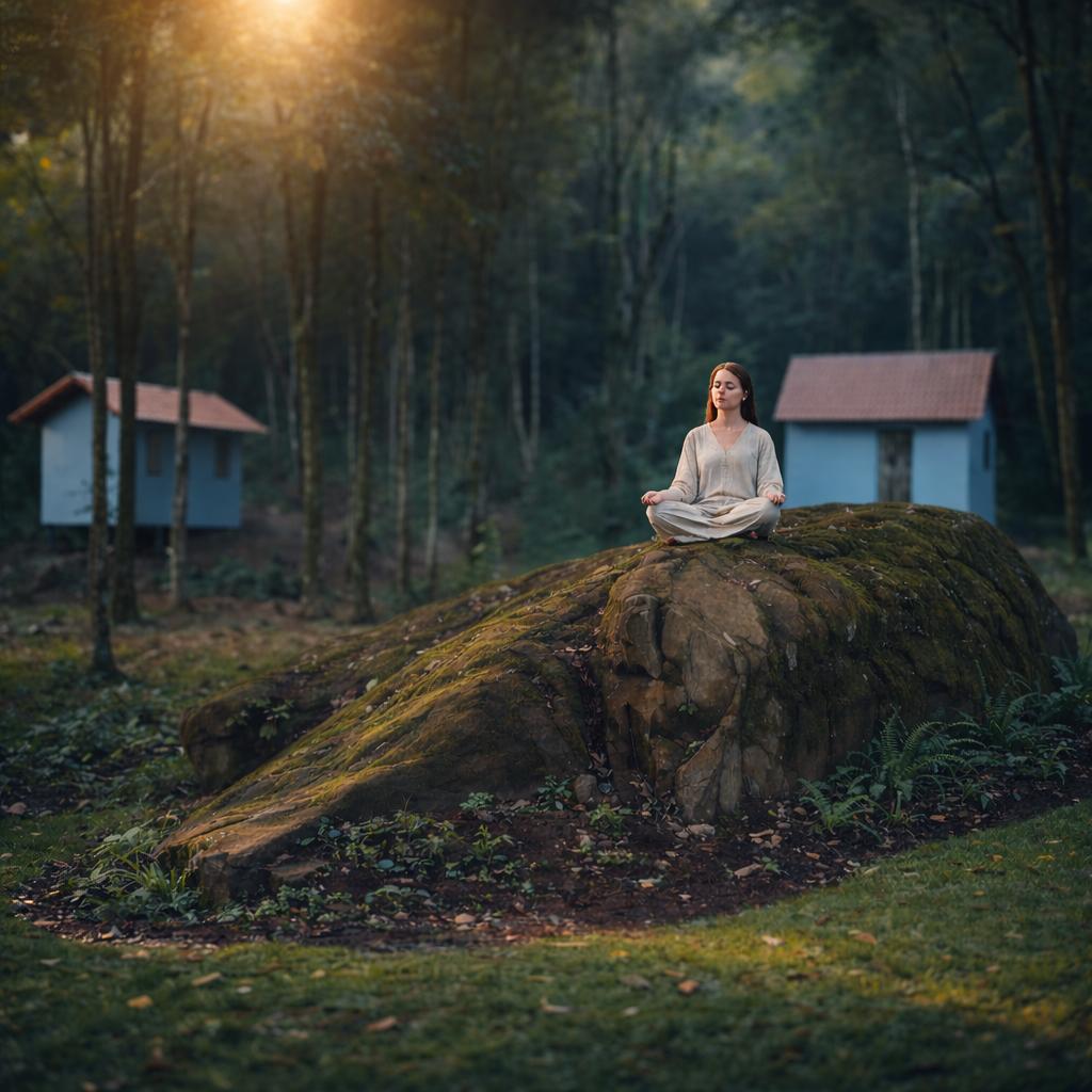
    title: 'Para quem precisa pausar',
    desc: 'Estadias individuais para quem sente necessidade de silêncio, natureza e alguns dias longe do excesso do mundo.',
    bullets: ['Retiro de silêncio', 'Dias de recolhimento', 'Reconexão pessoal', 'Pausa estratégica'],
    img: STOCK.paraQuem2,
    slotId: 'pq-2'
  }];


  return (
    <section id="para-quem" style={{
      padding: 'var(--section-y) 0',
      background: 'var(--bg-2)',
      borderTop: '1px solid var(--line)',
      borderBottom: '1px solid var(--line)'
    }}>
      <div className="container">
        <div style={{ textAlign: 'center', marginBottom: 72, maxWidth: 720, marginInline: 'auto' }}>
          <div className="eyebrow" style={{ marginBottom: 20 }}>03 · Para quem é</div>
          <h2 className="h2 serif">
            Dois caminhos,<br />
            <span className="italic" style={{ color: 'var(--gold)' }}>uma mesma serra.</span>
          </h2>
        </div>

        <div style={{
          display: 'grid',
          gridTemplateColumns: 'repeat(auto-fit, minmax(320px, 1fr))',
          gap: 32
        }}>
          {cards.map((c, i) =>
          <article key={i} style={{
            background: 'var(--card)',
            border: '1px solid var(--line)',
            borderRadius: 8,
            overflow: 'hidden',
            display: 'flex',
            flexDirection: 'column',
            transition: 'transform .5s cubic-bezier(.2,.7,.3,1), border-color .3s'
          }}
          onMouseEnter={(e) => {e.currentTarget.style.transform = 'translateY(-4px)';e.currentTarget.style.borderColor = 'rgba(212,184,150,.4)';}}
          onMouseLeave={(e) => {e.currentTarget.style.transform = 'translateY(0)';e.currentTarget.style.borderColor = 'var(--line)';}}>
            
              <image-slot
              id={c.slotId}
              src={c.img}
              shape="rect"
              fit="cover"
              placeholder={`Foto: ${c.title}`}
              style={{ width: '100%', aspectRatio: '3/2', display: 'block' }}>
            </image-slot>
              <div style={{ padding: '36px 32px 40px' }}>
                <div className="eyebrow" style={{ marginBottom: 14, color: 'var(--gold)' }}>{c.tag}</div>
                <h3 className="h3 serif italic" style={{ marginBottom: 16 }}>{c.title}</h3>
                <p style={{ color: 'var(--muted)', fontSize: 15, marginBottom: 24, lineHeight: 1.65 }}>{c.desc}</p>
                <ul style={{ listStyle: 'none', padding: 0, margin: 0, display: 'flex', flexDirection: 'column', gap: 8 }}>
                  {c.bullets.map((b, j) =>
                <li key={j} style={{
                  fontSize: 14,
                  color: 'var(--ink)',
                  paddingLeft: 18,
                  position: 'relative'
                }}>
                      <span style={{ position: 'absolute', left: 0, color: 'var(--gold)' }}>—</span>
                      {b}
                    </li>
                )}
                </ul>
              </div>
            </article>
          )}
        </div>
      </div>
    </section>);

}

// ─── Por que Luna (seção emocional — 2ª posição) ─────────────────────────
function PorqueLuna() {
  return (
    <section id="porque-luna" style={{
      padding: 'var(--section-y) 0',
      background: 'var(--bg-2)',
      borderTop: '1px solid var(--line)',
      borderBottom: '1px solid var(--line)'
    }}>
      <div className="container">

        {/* Linha 1 — imagem esquerda + título/parágrafo direita */}
        <div style={{
          display: 'grid',
          gridTemplateColumns: '0.82fr 1.18fr',
          gap: 'clamp(32px, 4vw, 64px)',
          alignItems: 'center',
          marginBottom: 80
        }} className="pl-grid">

          {/* Imagem */}
          <div style={{
            borderRadius: 4,
            overflow: 'hidden',
            aspectRatio: '4/5',
          }}>
            <img
              src="gallery/porque-luna.jpg"
              alt="Mulher meditando na pedra ao ar livre no Espaço Luna"
              style={{ width: '100%', height: '100%', objectFit: 'cover', display: 'block' }}
            />
          </div>

          {/* Título + parágrafo — alinhados à direita */}
          <div style={{ textAlign: 'right' }}>
            <h2 className="h2 serif" style={{ marginBottom: 32, fontSize: 'clamp(32px, 4.5vw, 58px)', textWrap: 'nowrap' }}>
              <span className="italic" style={{ whiteSpace: 'nowrap' }}>Mais do que quartos.</span><br />
              <span style={{ color: 'var(--gold)', whiteSpace: 'nowrap' }}>Mais do que um salão.</span>
            </h2>
            <p style={{ fontSize: 'clamp(15px, 1.4vw, 18px)', lineHeight: 1.8, color: 'var(--muted)' }}>
              O Espaço Luna nasceu para ser mais do que um local de hospedagem ou eventos.
              Cada loft recebeu o nome de uma deusa. Cada trilha, cada fogueira, cada canto do espaço
              foi pensado para favorecer encontros, pausas e experiências de transformação.
            </p>
          </div>

        </div>

        {/* Linha 2 — três pilares (igual ao original) */}
        <div style={{
          display: 'grid',
          gridTemplateColumns: 'repeat(3, 1fr)',
          gap: 1,
          background: 'var(--line)',
          border: '1px solid var(--line)',
          marginBottom: 80
        }} className="pl-pillars">
          {[
            { label: 'Há lugares que oferecem', value: 'estrutura.' },
            { label: 'Outros oferecem', value: 'atmosfera.' },
            { label: 'Aqui, as duas coisas', value: 'caminham juntas.' },
          ].map((p, i) => (
            <div key={i} style={{
              background: 'var(--bg)',
              padding: '44px 36px',
              display: 'flex',
              flexDirection: 'column',
              gap: 12
            }}>
              <p style={{ fontSize: 13, color: 'var(--muted)', lineHeight: 1.5, margin: 0 }}>{p.label}</p>
              <p className="serif italic" style={{ fontSize: 'clamp(22px, 2.4vw, 28px)', color: 'var(--gold)', margin: 0, lineHeight: 1.2 }}>{p.value}</p>
            </div>
          ))}
        </div>

        {/* Linha 3 — citação Por que Luna (igual ao original) */}
        <div style={{
          maxWidth: 760,
          marginInline: 'auto',
          textAlign: 'center',
          padding: '0 clamp(16px, 4vw, 56px)'
        }}>
          <div className="ornament" style={{ marginBottom: 36, maxWidth: 200, marginInline: 'auto' }}>
            <span>Por que Luna</span>
          </div>
          <blockquote style={{
            margin: 0,
            padding: 0,
            fontSize: 'clamp(18px, 2vw, 24px)',
            fontFamily: 'var(--serif)',
            fontStyle: 'italic',
            lineHeight: 1.6,
            color: 'var(--ink)',
          }}>
            "Assim como a lua influencia marés, ciclos e movimentos da natureza, acreditamos
            que cada pessoa também possui seu próprio tempo de expansão, recolhimento e renovação.
            O Espaço Luna foi criado para acolher esses ciclos."
          </blockquote>
        </div>

      </div>
      <style>{`
        @media (max-width: 860px) {
          .pl-grid { grid-template-columns: 1fr !important; }
          .pl-grid > div:first-child { aspect-ratio: 16/9 !important; }
          .pl-grid > div:last-child { text-align: left !important; }
          .pl-pillars { grid-template-columns: 1fr !important; }
        }
      `}</style>
    </section>
  );
}

Object.assign(window, { Hero, Estrutura, Galeria, ParaQuem, PorqueLuna, STOCK });